How do you combine food truck ordering in one app, and make it simple?
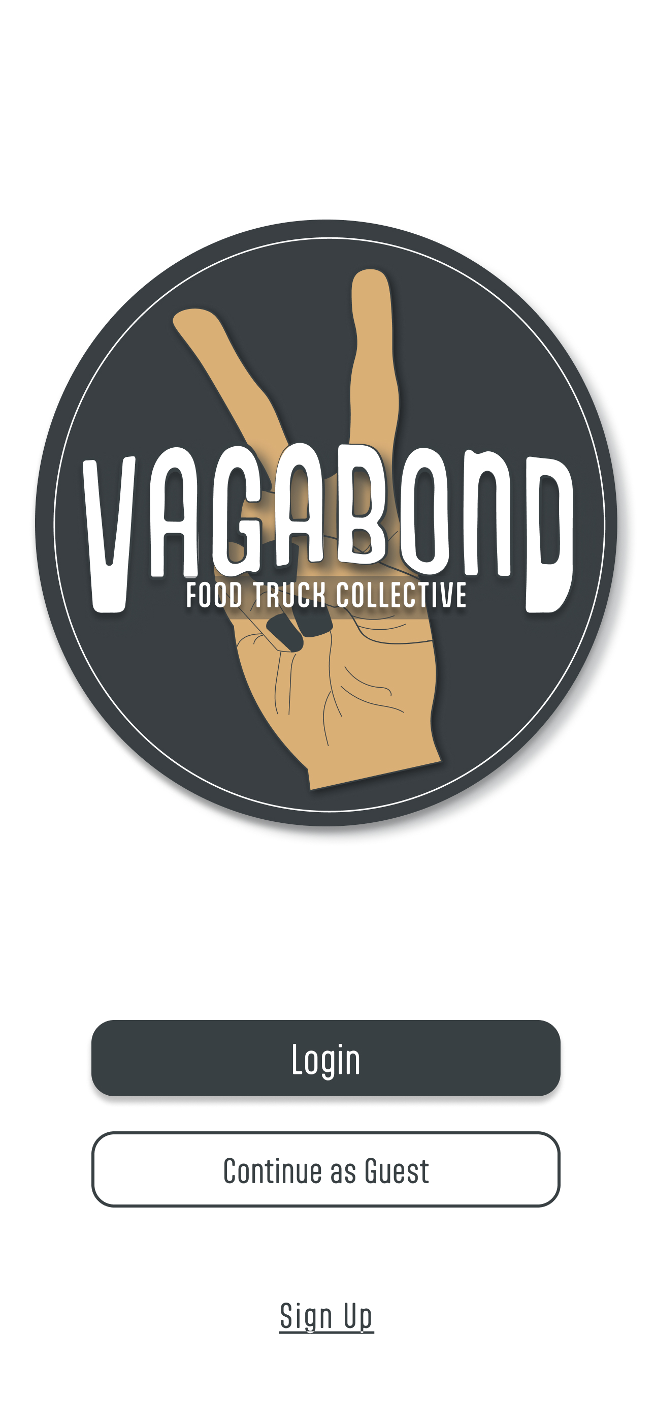
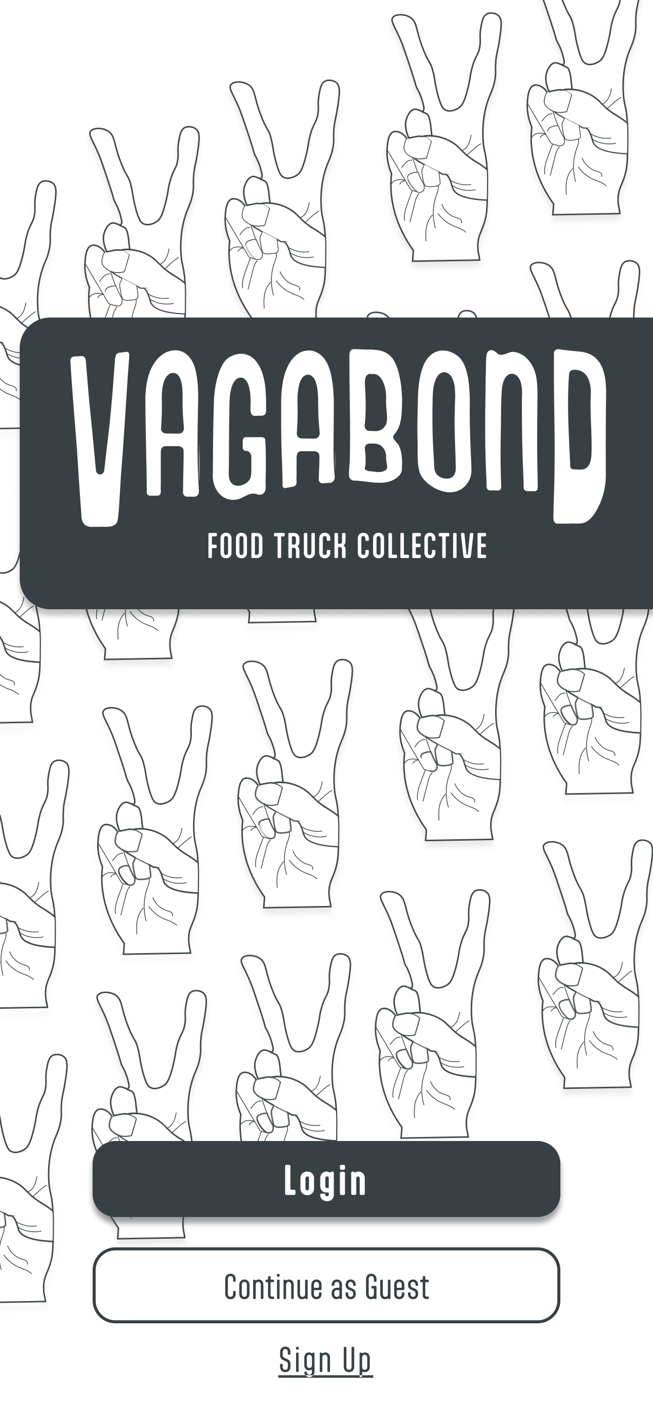
Opening screen iterations — three design directions tested before landing on the final Vagabond identity.
Ordering from a food truck shouldn't be stressful.
Food trucks are beloved — but the experience of ordering from one is often filled with friction. Not knowing what payment methods are accepted, which menu items are in stock, or how to navigate language and accessibility barriers makes what should be a simple transaction feel unnecessarily hard.
The goal was to design Vagabond — an app that gives customers clear, real-time information so they can browse, order, and pay from their phone, without any of the usual guesswork.
I went in thinking wait time was the problem. I was wrong.
I interviewed users who regularly ordered from food trucks using recorded video sessions with a structured script. I expected long wait times to be the primary complaint. They weren't mentioned once. Instead, every pain point traced back to a lack of clear, up-to-date information at the point of ordering.
"The problem isn't the wait — it's not knowing what you're waiting for, or whether you can even pay for it."
Not knowing accepted payment methods ahead of time caused anxiety and decision paralysis before customers even reached the window.
Finding out a menu item was sold out only when ordering — with a line behind you — was a leading source of frustration.
Unfamiliar menu items with no photos or descriptions left customers guessing, reducing confidence and slowing ordering.
Noise, language differences, and limited accessibility at ordering windows made customizing orders or asking questions difficult.
There was a clear gap in the market.
I audited four key players: FoodTruck Pub, Toast, Square, and GrubHub. Each had strengths, but none fully served the food truck customer. The opportunity was clear: a collective food truck app with in-app ordering, real-time menus, secure payment, and accessibility-forward design — with a fee structure that didn't burden small vendors.
Vagabond — fresh, familiar, and built to move.
The brand reflects the spirit of food trucks: edgy, creative, and mobile. The UI was designed to feel fresh and familiar — approachable for a first-time user, confident enough to feel like a real product. After wireframing and lo-fi prototyping, I built a full hi-fi prototype with a complete design system and component library.
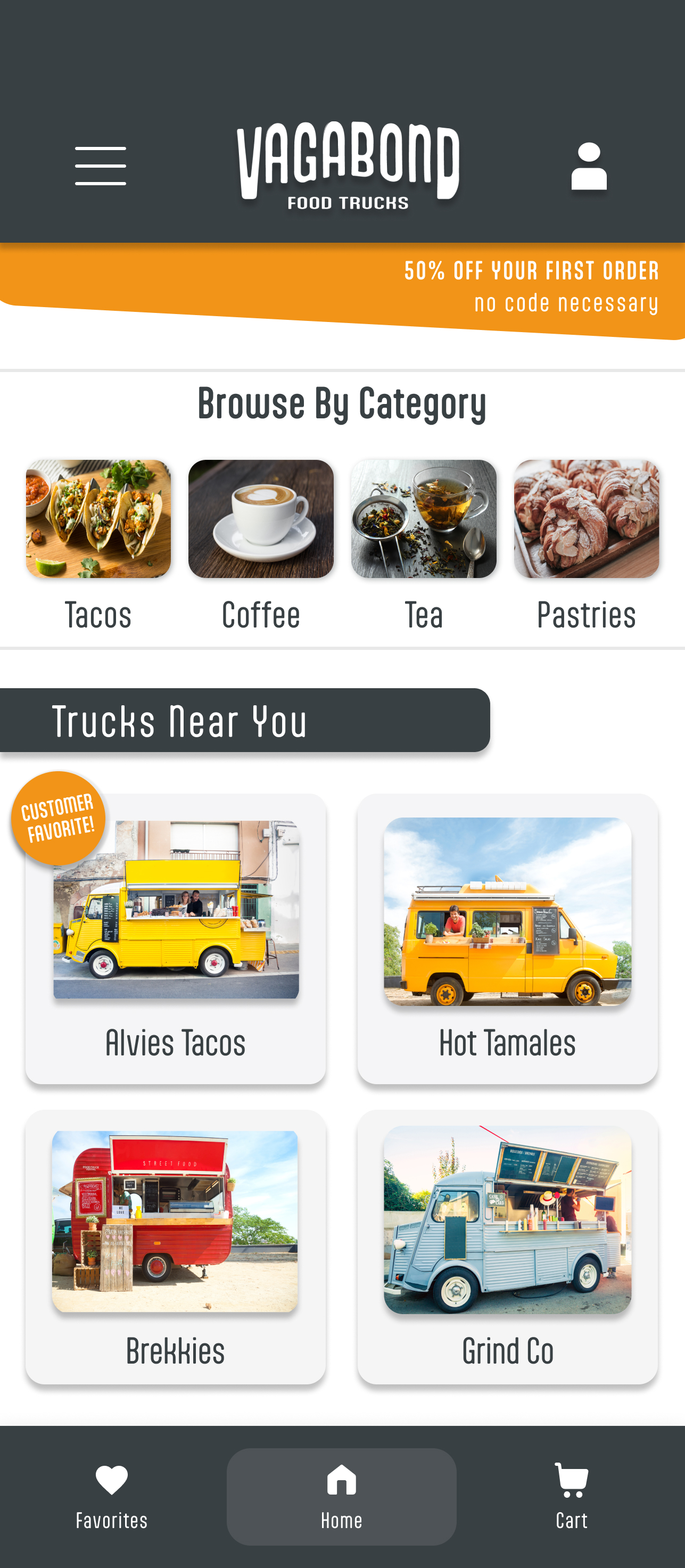
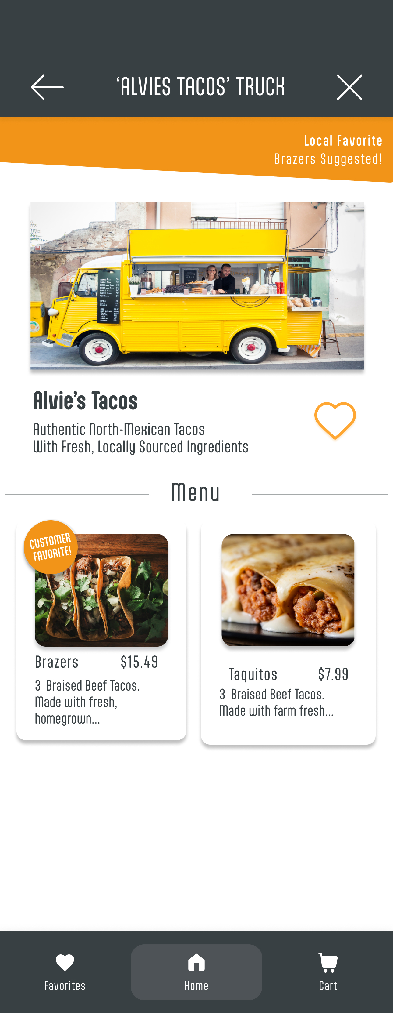
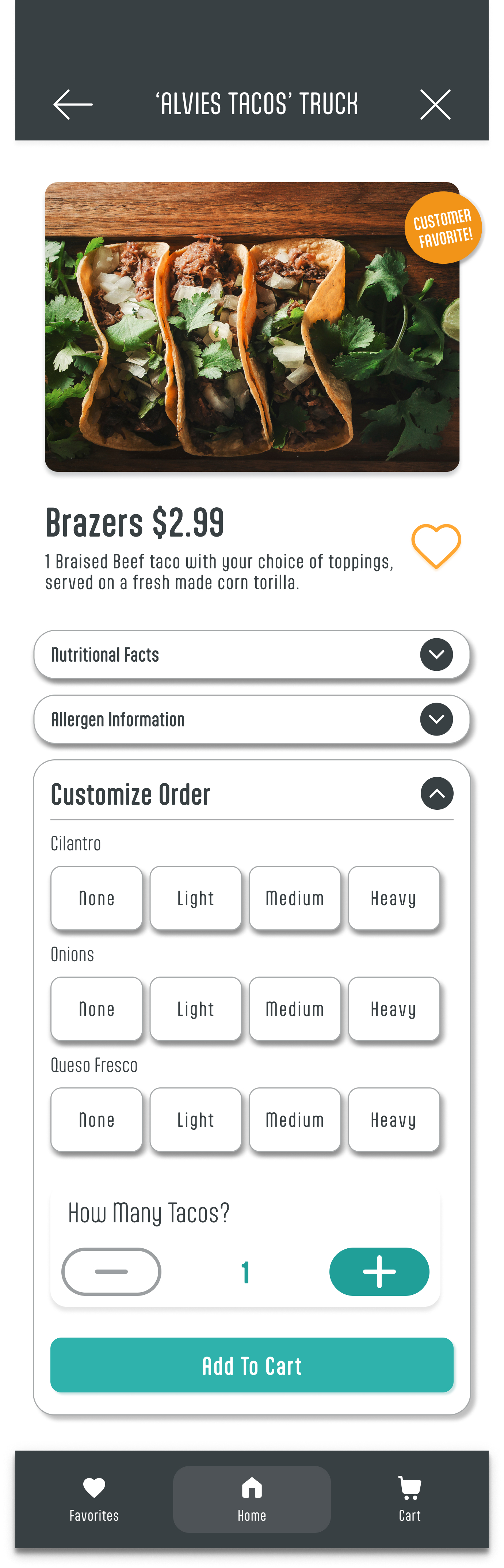
Home → vendor → item. Photos, descriptions, and customization options address the core pain points surfaced in research.
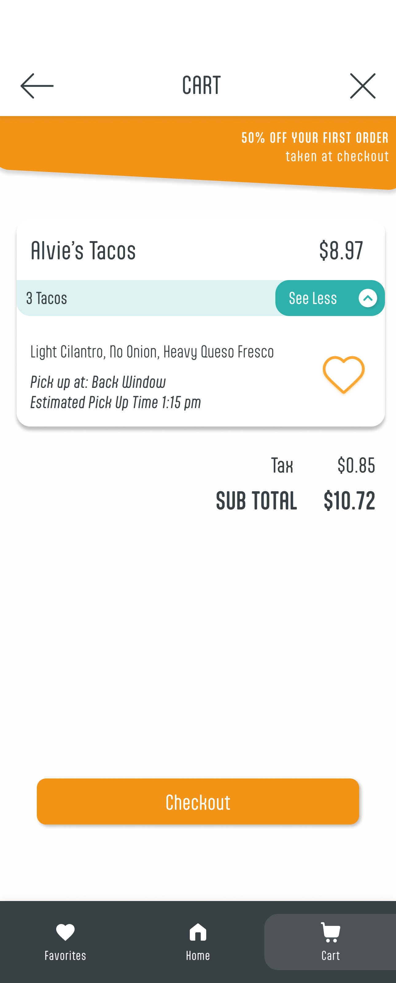
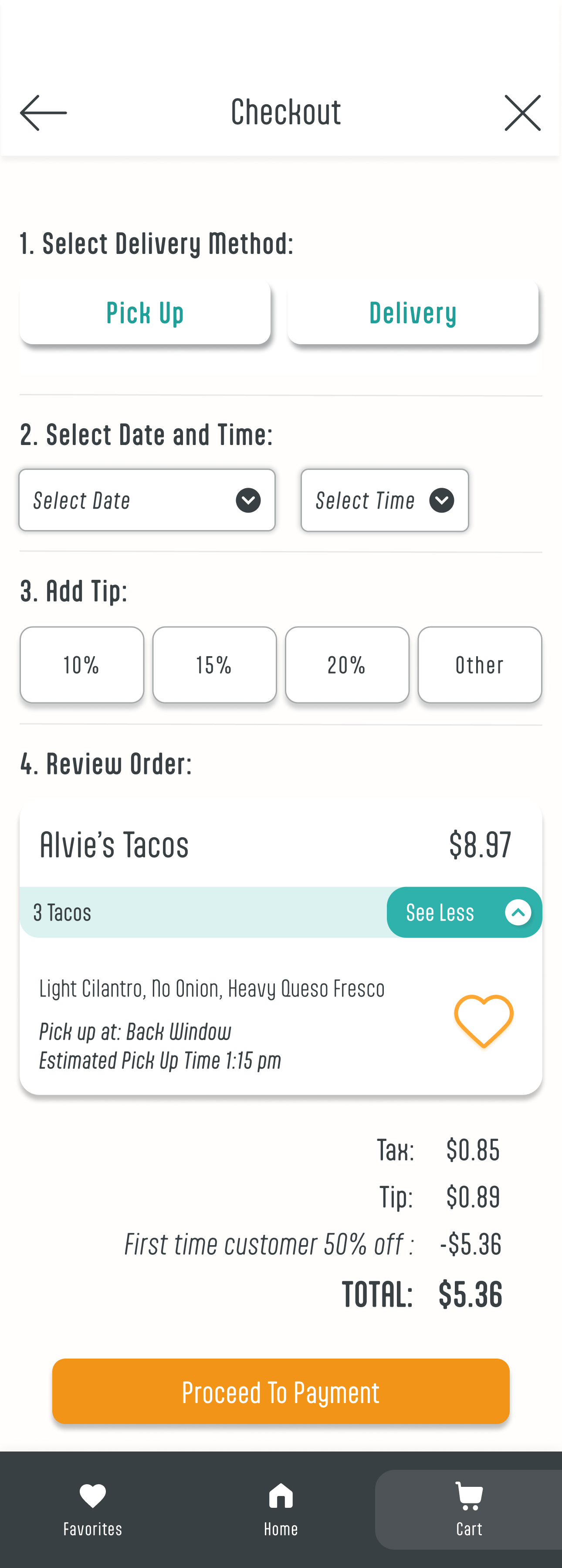
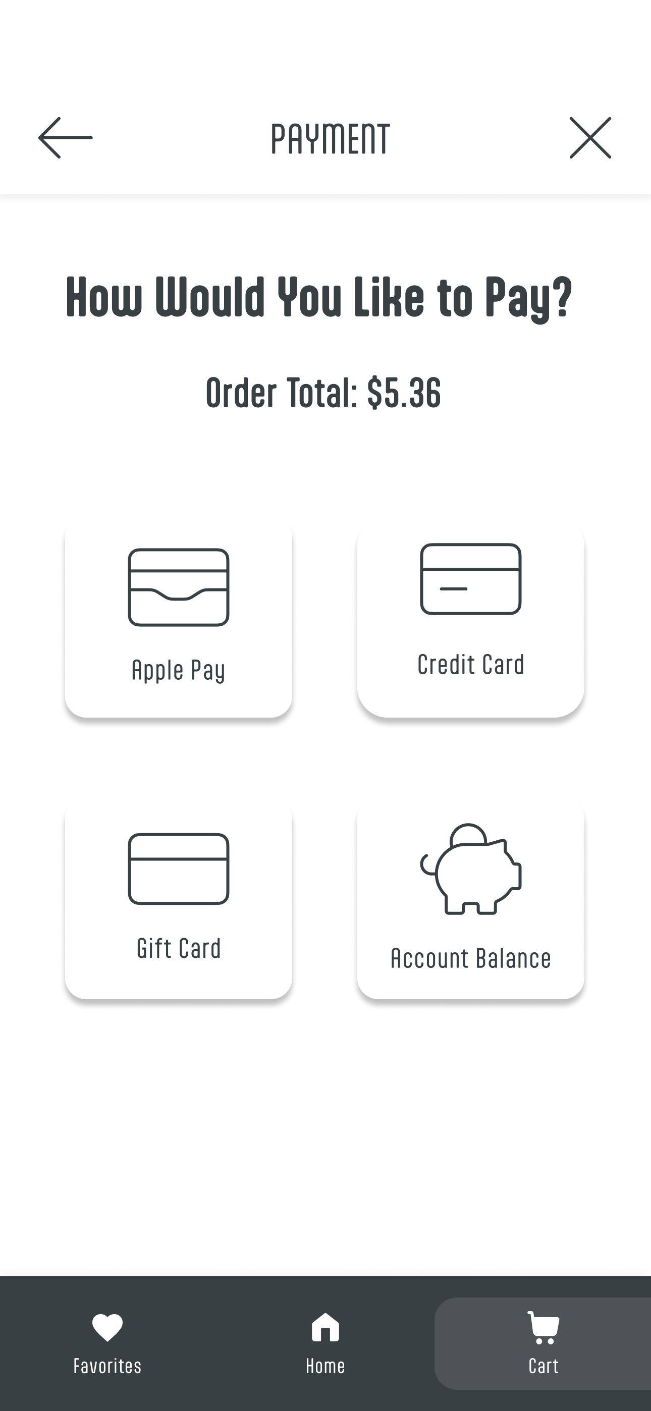
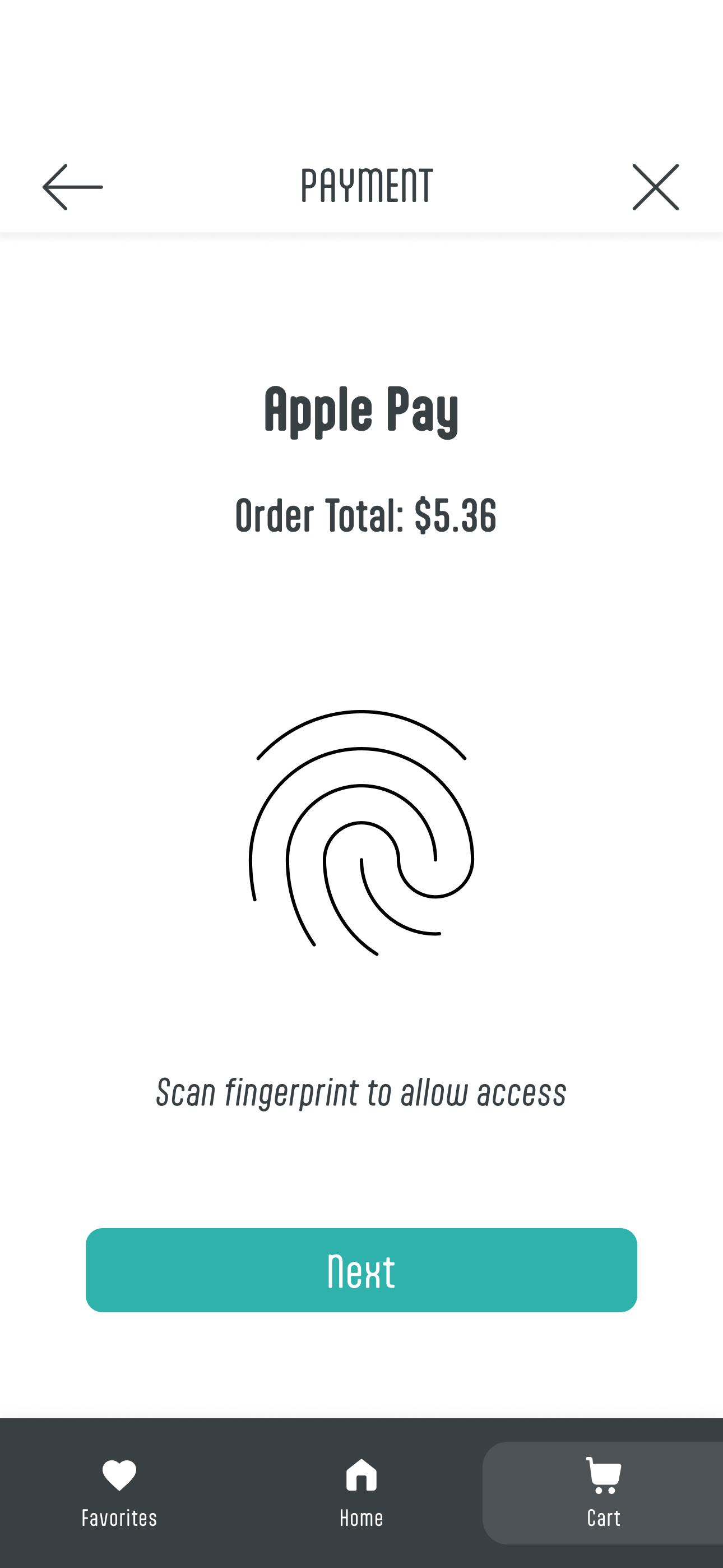
Cart through payment — in-app ordering with multiple payment methods eliminates the cash/card uncertainty entirely.
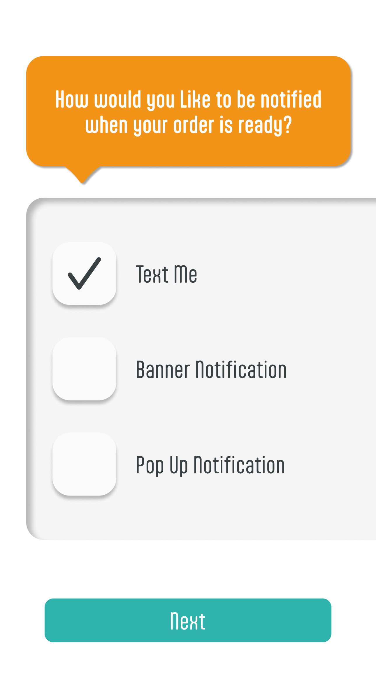
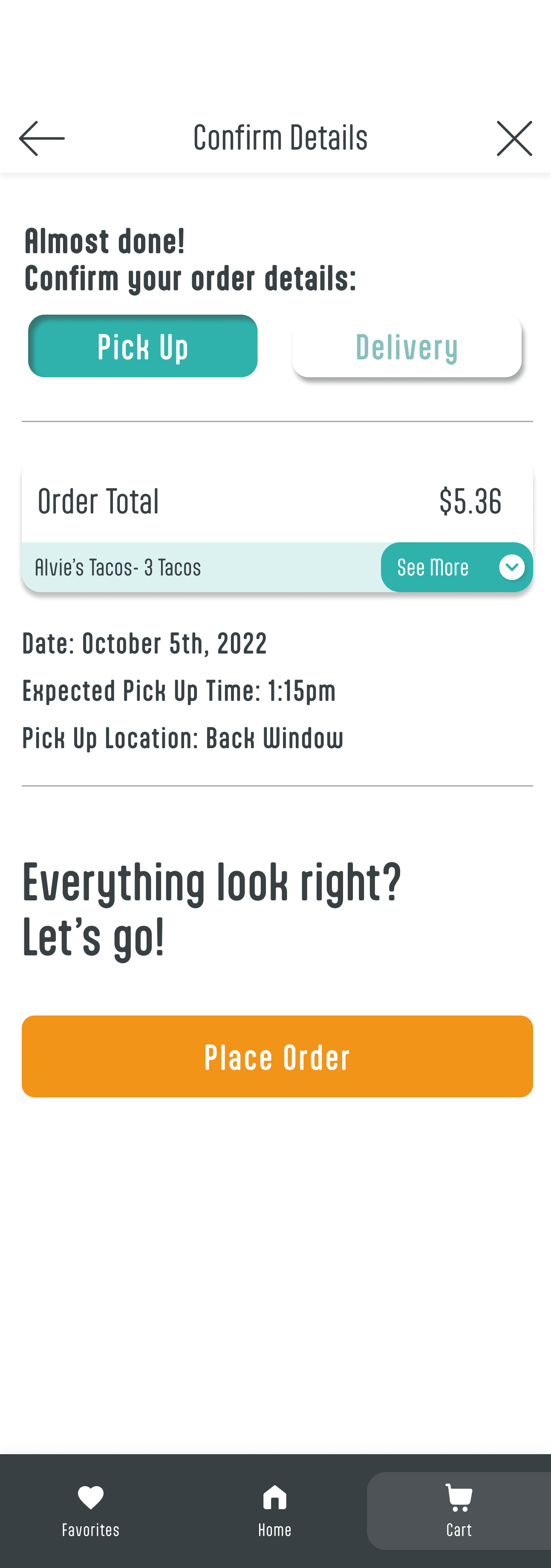
Post-order — notification, confirmation, and favorites. Each screen addresses a finding from the usability study.
View interactive prototype in Figma →Four participants. Three findings. Three solutions.
I ran an unmoderated usability study remotely with 4 participants, asking them to find a truck, browse the menu, place an order, and pay. Sessions were 20–30 minutes. Three clear areas for improvement emerged — each addressed before the final prototype.
Users struggled to navigate back to the home screen once deep in the ordering flow.
Added a persistent bottom navigation bar with Home, Cart, and Favorites — icons and labels for accessibility.
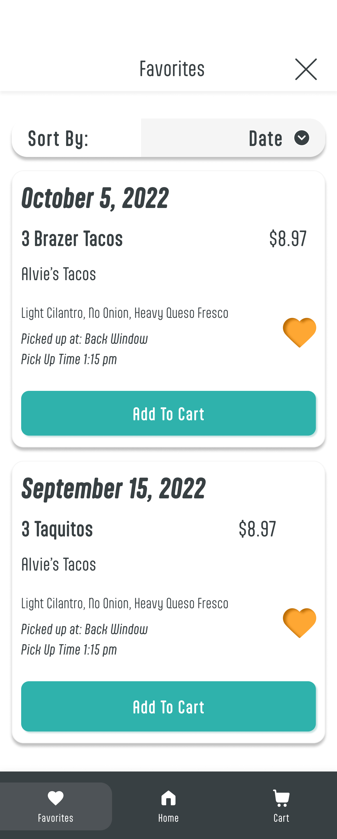
Users wanted to sort saved items in more than one way — by truck alone wasn't enough.
Built a sort dropdown: by date of order, truck name, or menu item — covering every user's search preference.
Users felt limited by a fixed tip and wanted control over what they spent.
Designed a dual tipping component: percentage buttons plus an incremental counter with + and − controls.
Listen first. Assume nothing.
"Going in with assumptions is part of the process — as long as you're willing to let the research prove you wrong. I thought this was a wait time problem. It wasn't. Listening changed everything about the direction of this app."