How do you redesign a homepage used by 400,000 people every day — as the only designer on the project?
Client identity is confidential. All screenshots are shown at reduced scale or in wireframe form to protect proprietary content while demonstrating design process and scope.
Final homepage redesign shown across all responsive breakpoints — mobile through desktop. Client identity withheld.
Two major projects. One designer. High stakes from the start.
This engagement had two distinct but connected workstreams running in parallel: a platform migration and design system build in Figma, and a full homepage redesign for one of the organization's most trafficked digital properties — a nonprofit serving over 400,000 unique daily visitors.
I was the sole designer on both. The design system work directly fed into the homepage redesign — the components, tokens, and variables I built became the foundation for every new design decision on the page.
Moving a legacy asset library into Figma — then building something better.
InVision was sunsetting, and the existing design asset library needed a new home. But rather than simply moving files, I used the migration as an opportunity to build something that hadn't existed before: a proper, structured design system in Figma — the kind that scales, stays consistent, and makes future work faster.
The system was built to serve both a website and a mobile app simultaneously, with a component architecture that allowed new design decisions to propagate through child files automatically. When I introduced new design features during the homepage redesign, I was able to push those updates through the system — every connected screen updated in sync.
A full component library built with variants and properties — buttons, cards, nav elements, forms, and content modules all documented and reusable.
Color, typography, spacing, and radius tokens defined as Figma variables — a single source of truth that keeps every screen visually consistent.
A fully documented color system with semantic naming — primary, secondary, surface, error, and interactive states — applied consistently across web and app.
Every icon and image asset needed for the product organized, named, and documented within the system — nothing loose, nothing duplicated.
Complete page designs built from system components — not just a component library, but a working demonstration of how the system comes together at page level.
The Figma workspace was structured to interact directly with the team's project management system — design and delivery in the same flow, no handoff friction.
The client wanted change — but wasn't sure how much.
The homepage redesign brief was deliberately open-ended: the client knew they wanted a refresh, with organizational changes underway, but hadn't defined how far they were willing to go visually. My job was to explore the edges of their comfort zone — pitching new content sections and layout ideas — while staying anchored to what their users already relied on.
I started with hand-drawn wireframes deliberately. At that scale of traffic, any major change carries real risk — and hand-drawn sketches are the fastest, lowest-stakes way to test whether a client is ready to move in a new direction. Once I understood their threshold for change, I moved into lo-fi digital prototypes, then into full mockup iterations reviewed by a board and multiple stakeholders.
Throughout, I worked directly with the development team, whose technical feedback served as the foundational litmus test for every new feature I proposed. If it couldn't be built cleanly, it didn't make it in — and that constraint actually sharpened the design.
The client knew they wanted change but couldn't articulate how much. Determining that threshold — without overstepping it — required careful listening and strategic sequencing of what got presented when.
A full board and multiple stakeholders giving input across many design iterations. Managing feedback from that many voices — finding signal in the noise — without losing the design's direction.
Every feature was pressure-tested by the development team before it could stay in. Rather than fighting those constraints, I used them to make cleaner, more intentional decisions.
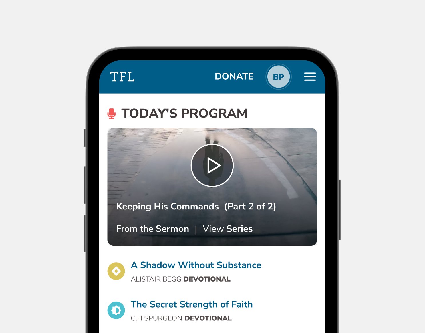
With 400k+ daily visitors, the existing page had deeply established user patterns. The redesign had to introduce new features and sections without disorienting people who already knew how to use it.
Hand-drawn to hi-fi — earning each level of fidelity.
The process moved deliberately through levels of fidelity, with each stage earning the right to move to the next by validating the client's comfort with the direction.
Low-commitment, fast to change. Used to test the waters of how much the client was willing to move before investing design time in any direction.
Once direction was established, moved into Figma wireframes across all breakpoints — establishing structure, hierarchy, and user flow across device sizes.
High-fidelity design iterations presented to the board and stakeholders. Multiple rounds incorporating feedback while protecting the core design direction.
Final designs handed off through the design system — components, specs, and assets organized so developers could build without ambiguity.
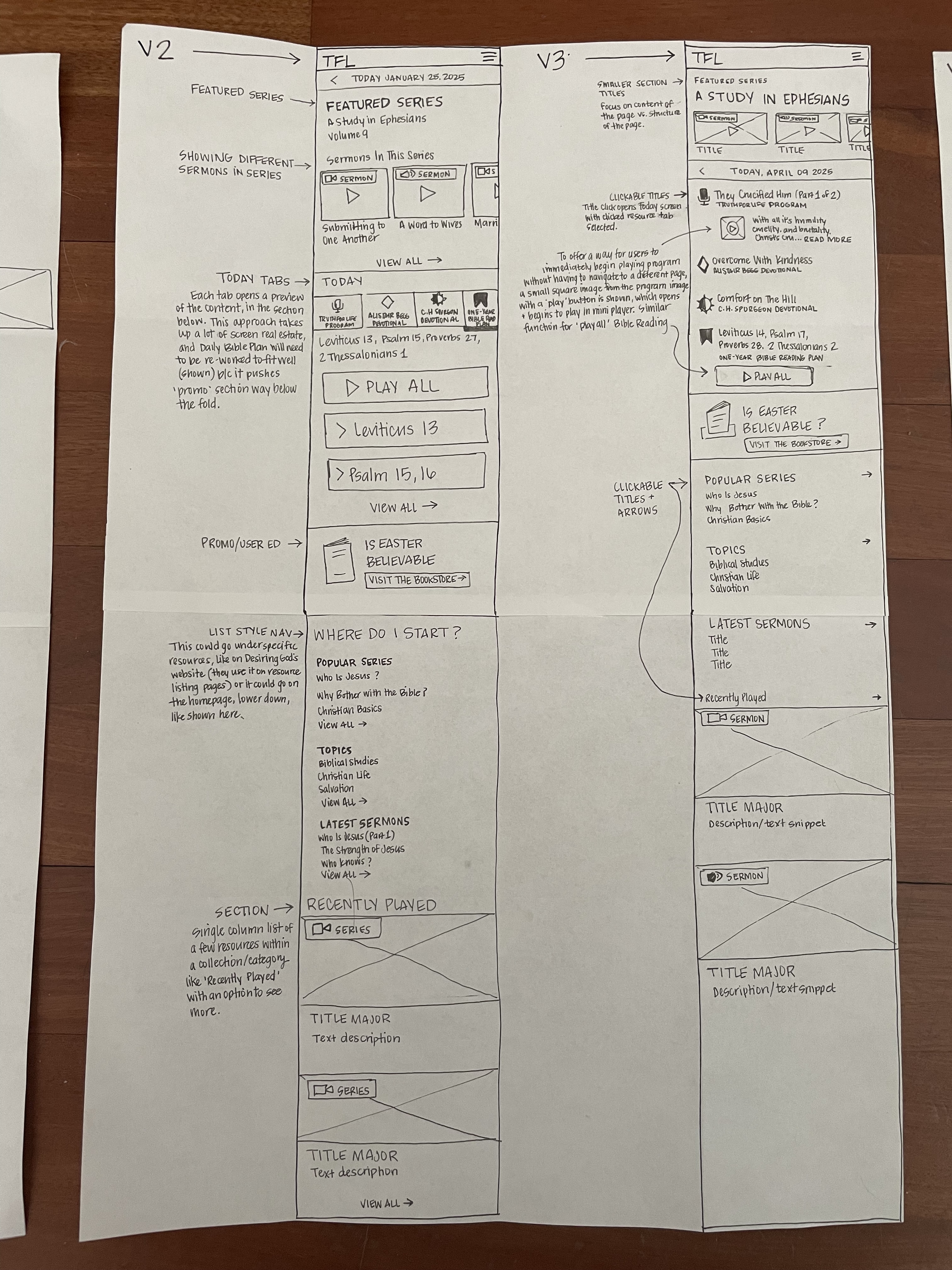
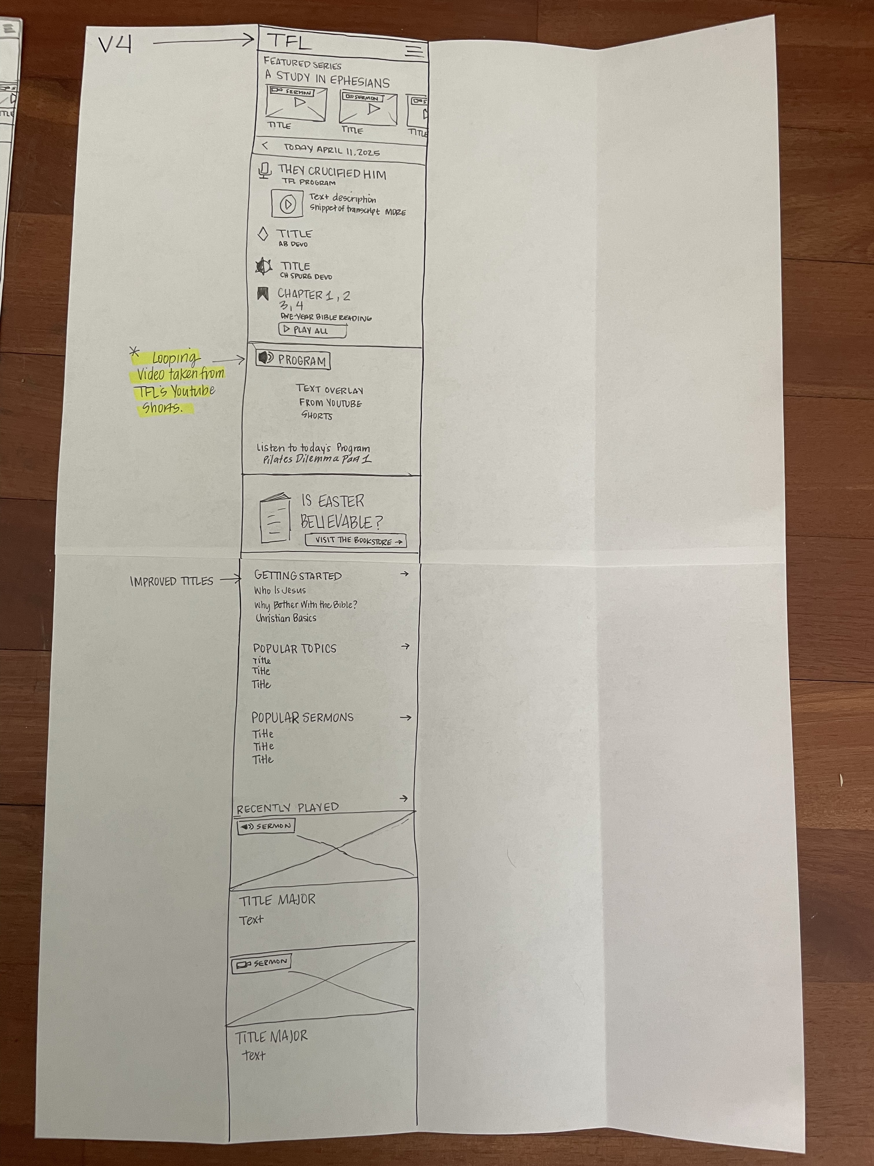
Hand-drawn wireframes — V2, V3, and V4 iterations with annotations. Starting at this fidelity kept the client from feeling locked in to any direction too early.
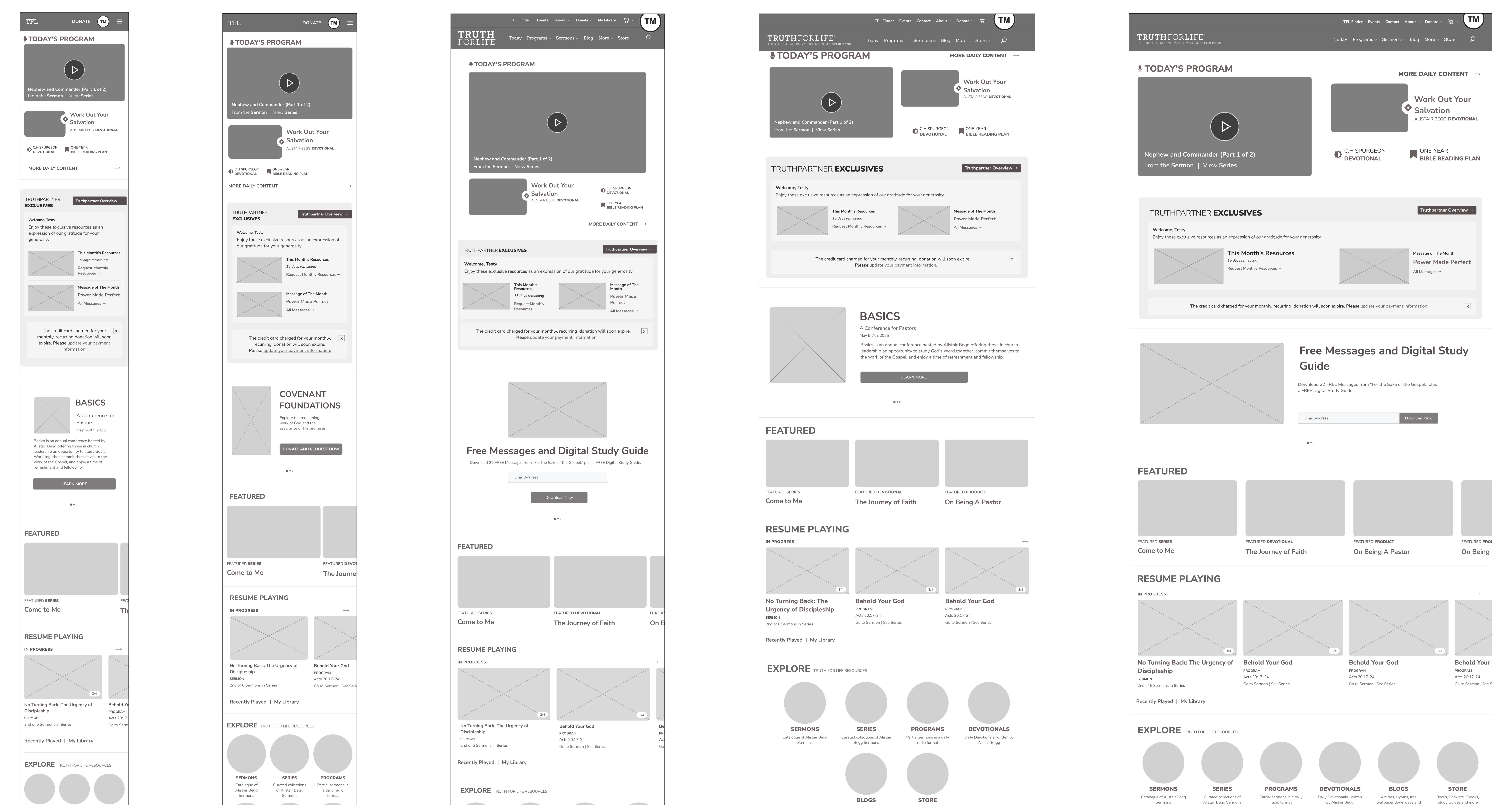
Lo-fi digital prototypes across 5 responsive breakpoints — structure and hierarchy locked in before any visual design decisions were made.
Familiar enough to trust. Fresh enough to feel new.
The final redesign introduced new content sections and updated visual language while preserving the navigational patterns and content hierarchy that 400,000 daily visitors already relied on. New features were introduced where they added genuine value — not as decoration.
Because the homepage was built from the design system I'd constructed, new design decisions could be pushed through child files to update connected screens simultaneously. The system didn't just support the redesign — it made it sustainable for the team long after handoff.
I'm most proud of delivering something that felt like a meaningful creative leap within constraints that were genuinely tight. That's the work — not the work where you have full freedom, but the work where you find the best possible answer within the real limits of what's buildable, stakeholder-approvable, and user-safe.
"Working with a board and multiple stakeholders as the sole designer taught me that the design itself is only part of the job. The other part is sequencing what you show and when — earning trust incrementally, starting with hand-drawn sketches so nobody feels locked in, and building toward high-fidelity only once the direction is genuinely agreed on. The developer constraint was a gift in disguise. Every time I had to remove something, the design got cleaner."